Your organization is safe, and you have implemented all the necessary processes. You are compliant and in place with all the regulations, so you think all safety processes are done?
Unfortunately no!
You must convey the details to the stakeholders, investors, and top management. And believe it or not, this is also one of the most crucial safety aspects!
But we know how daunting making reports and presentations can be. Therefore, we have an ultimate solution for all your reporting woes. The name of the solution is Business Intelligence tools.
We have curated this blog to tell you how easy communicating EHS insights to stakeholders with BI data visualization is.
BI tools convert complex data into clear and actionable insights for informed decision-making. This eventually helps in driving positive changes throughout the organization. Let us see how this works.
What EHS Data Visualization Means?
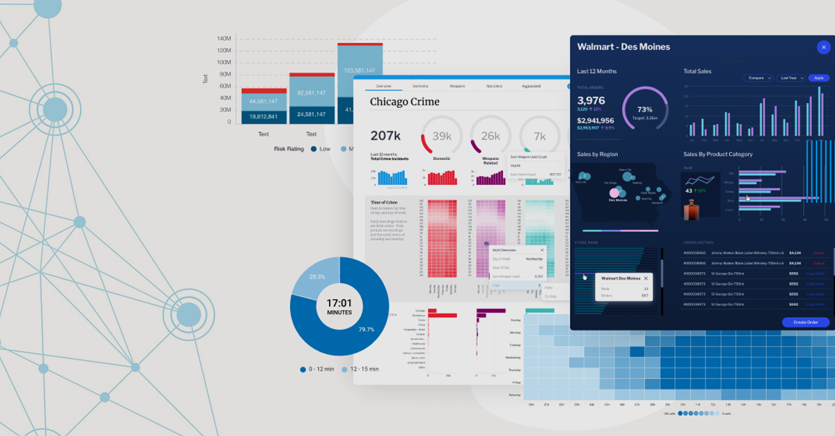
EHS data visualization means the graphical and pictorial representation of the EHS data. These representations include charts, graphs, maps, and visually appealing dashboards.
Basically, this method transforms complex and voluminous EHS data into visual formats that are easy to understand, interpret, and analyze. The primary goal of EHS data visualization is to communicate meaningful insights, trends, patterns, and correlations within the data, thus helping stakeholders to make informed decisions about environmental conservation, workplace safety, and regulatory compliance.
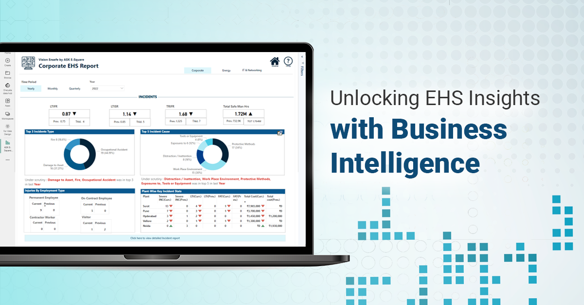
Here are some examples for a better understanding.
These visuals make it easy to understand EHS data and get to the root cause of incidents and near-misses. Plus, they are handy during audits and inspections, whether planned or surprise!
Why EHS Data Visualization Matters?
BI data-driven organizations are five times more likely to make faster decisions, as per a survey by Aberdeen Group.
89% of companies with well-established data access and governance are confident in their regulatory compliance (Forrester Consulting)
According to a study by Dresner Advisory Services, 48% of organizations believe data visualization is critical to their business operations.
The above stats clearly state that data visualization has improved efficiency and encouraged employees to foster a safe culture.
Now, let us concentrate on how EHS Data Visualization helps communicate EHS information to the stakeholders.
1. Enhanced Understanding:
When stakeholders can access near/real-time data in visuals, they can see if a positive or negative pattern forms over time. Thus, these visuals help stakeholders understand patterns, leading to proactive safety measures.
2. Data-Driven Decision Making:
Basically, every solution will have data to support it. If incidents arise from a particular contractor on board, they can be immediately identified through the EHS data visuals. Also, comparative analysis of EHS data across multiple locations assists in identifying best practices and implementing standardized safety protocols.
Stakeholders can easily see the data for themselves and have reasons in front of them to accept the safety officers’ decisions.
3. Improved Compliance:
It is difficult for stakeholders to handle audits, compliances, and regulations if there is little or no data to support compliance. Plus, the paperwork for compliance is tedious. Therefore, when EHS data Visualization tools assess the safety processes against the regulations, it becomes seamless to comply with local and international laws.
Also, visualizing regulatory compliance data ensures stakeholders can quickly assess adherence, reducing legal risks.
Now, here are a few more examples wherein EHS data visualization escalates workplace safety and helps stakeholders in decision-making.
How To Implement EHS Data Visualization?
The only answer to the above question is by consulting the experts!
Your organization has varied EHS data sources. BI tools source these data from various sources and amalgamate them on a single platform. However, the correct implementation and integration of these tools must be done by consulting the BI experts. These experts understand your EHS needs and accordingly incorporate the best settings.


